![]()
ggautomap helps when you have a spreadsheet/table of
data that includes a column of place names, and you want to visualise
that data on a map. It saves you from having to think about geospatial
libraries when all you want to do is make a quick plot from your
spreadsheet.
See the
‘Getting started’ article, vignette("ggautomap"), for
some recipes for different types of plots it can make.
ggautomap works best if:
{cartographer}.ggautomap might not be right for you if …
… the place names in your location column aren’t known to
{cartographer}. You’ll have to register the map data with
cartographer::register_map() or load a package that does
this for you. This is fairly painless to set up, and can be reused for
subsequent plots once you get it working.
… your data is about points instead of regions, or has only a single row for each region with aggregate data.
… your data has latitude and longitude columns, or is already a
geospatial object such as an {sf} dataframe.
… you want to manipulate the geometries or otherwise have more
control. ggautomap is aimed at the simple case, so the
geometries are attached on the fly when the plot is compiled.
In most of these cases, you should instead use a combination of
{sf}, ggplot2::geom_sf(), and possibly
{cartographer} to have more direct control. If you just
want the map insets from the vignette, see
{ggmapinset}.
You can install ggautomap like so:
# CRAN release
install.packages('ggautomap')

# development version
install.packages('ggautomap', repos = c('https://cidm-ph.r-universe.dev', 'https://cloud.r-project.org'))Let’s use the example dataset from {cartographer}:
library(cartographer)

head(nc_type_example_2)
#>      county type
#> 1    MARTIN    A
#> 2  ALAMANCE    B
#> 3    BERTIE    A
#> 4   CHATHAM    B
#> 5   CHATHAM    B
#> 6 HENDERSON    B
A possible workflow is to use
cartographer::add_geometry() to convert this into a spatial
data frame and then use ggplot2::geom_sf() to draw it.
ggautomap instead provides geoms that do this
transparently as needed, so you don’t need to do a lot of boilerplate to
wrangle the data into the right form before handing it off to the
plotting code.
library(ggplot2)
library(ggautomap)

ggplot(nc_type_example_2, aes(location = county)) +
  geom_boundaries(feature_type = "sf.nc") +
  geom_geoscatter(aes(colour = type), size = 0.5) +
  coord_automap(feature_type = "sf.nc")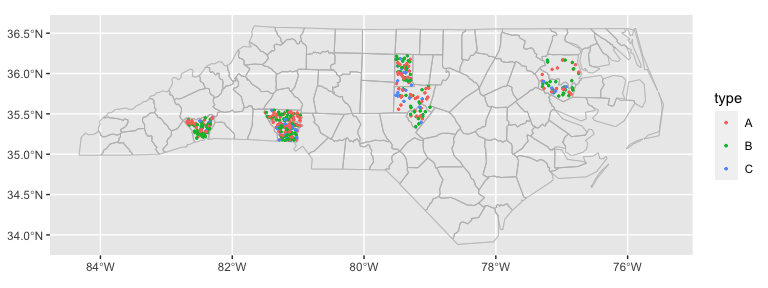
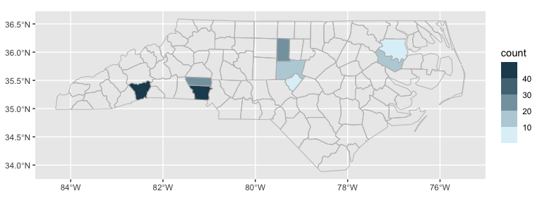
ggplot(nc_type_example_2, aes(location = county)) +
  geom_choropleth() +
  geom_boundaries(feature_type = "sf.nc") +
  scale_fill_steps(low = "#e6f9ff", high = "#00394d", na.value = "white") +
  coord_automap(feature_type = "sf.nc")